Responsive Buddy

As a web designer & developer, I need to constantly check my designs on large and small screens. I tried many browser extensions that help you test responsive designs, but most of them were too bloated or inconvenient. So I created my own – simple and opinionated.
I've been using it daily, so I thought – why not publish it, maybe it will be useful for you too!
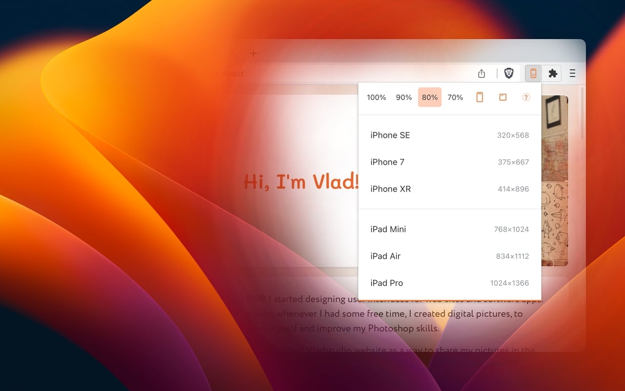
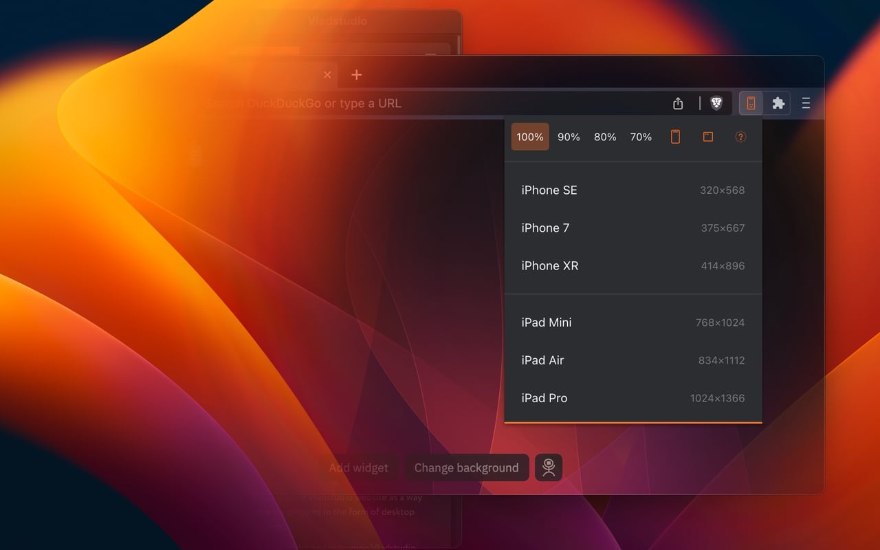
3 Phones, 3 Tablets
Most extensions require that I configure my own list of devices to simulate. Responsive Buddy only offers 3 phone and 3 tablet sizes, from small to large.
Zoom Out (100 To 70%)
Useful if you want to compensate the difference between your monitod DPI (pixel density) and the DPI of a target mobile device.
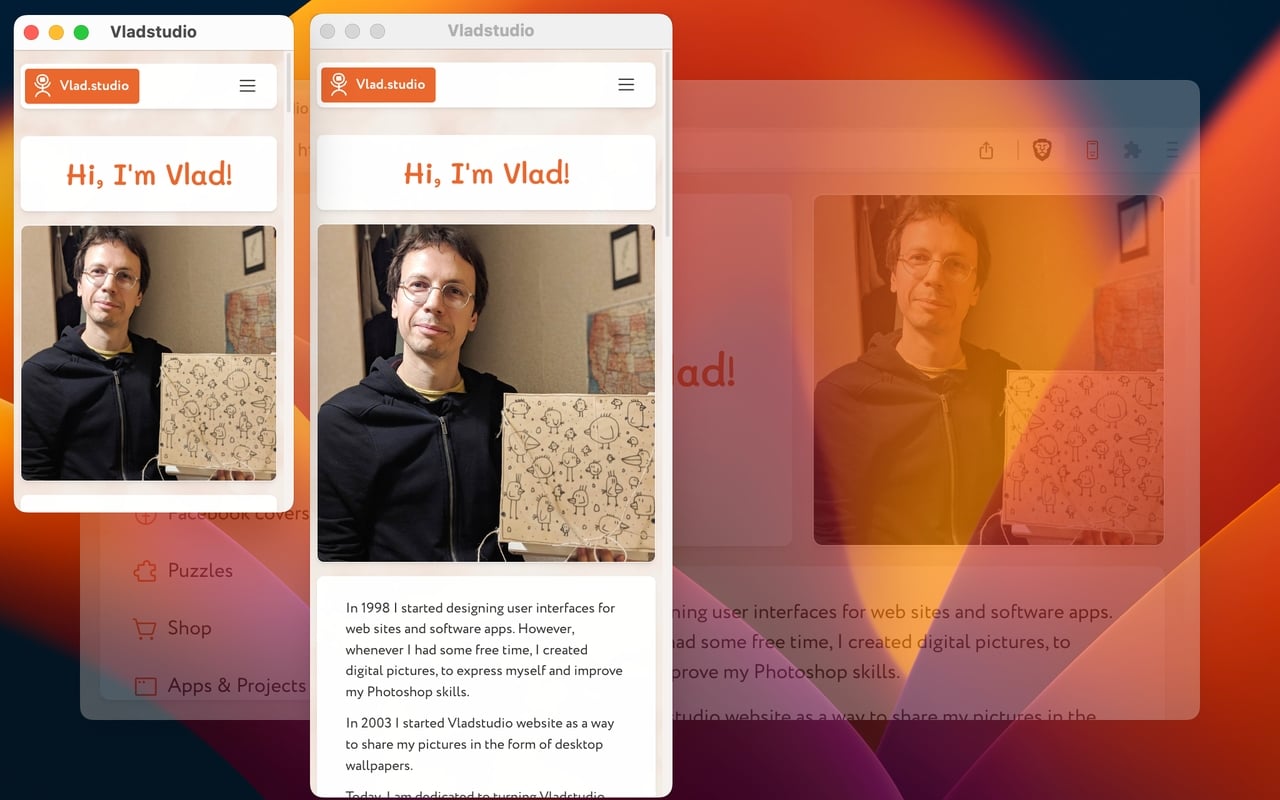
Portrait / Landscape
Switch between portrait and landscape orientation with a click of a button.
Dark Mode Support
Your eyes will thank you!
Iframe Mode Off Button
By default, Responsive Buddy creates an iframe, then transforms it to the selected zoom setting. It works well, unless a page refuses to be opened in an iframe. If that's the case, you can turn iframe mode off. See details below:

iframe mode on
|

iframe mode off
|
|---|---|
| will not work with protected pages | works with all pages |
| cannot be reloaded with Ctrl–R (but you can right-click and "Reload frame") | can be reloaded |
| keeps zoom setting if you click away | zoom setting is reset to 100% if you click away (due to limitation of Chrome Zoom API) |